Liber Ketola XXVI
2026-07-29
by Niklas Göransson
Since the days of Dauthus, Tilmann Benninghaus had guided Timo Ketola’s study of typography. Qabalah, Qliphoth and Goetic Magic turned that mentorship into direct collaboration – and opened a new chapter for The Ajna Offensive.
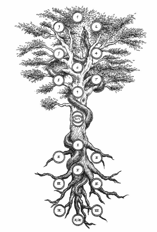
Tree of Life and Death, La Via Oscura, by Timo Ketola
TIMO KETOLA: Receiving an honorary mention from the bibliophile society of the Royal Library of Stockholm meant a great deal. It did, however, make me wonder whether it wasn’t the decadence of modern times that had opened the door to someone without any formal education in such a traditionalist field as typography.
Alongside album covers and other art commissions, Timo worked part-time as a book designer. While it never eclipsed artwork as a source of income, the discipline answered to a different impulse: his conviction that profound writing deserved dignity in print.
TIMO: When I broke the news to my mentor in book design, Tilmann from DROWNED, I told him that ‘we’ had received the diploma – because, really, everything I know about the craft began with his guidance, was reinforced by the books he recommended, and only later expanded through my own research.
The connection reaches back to 1996, when Tilmann Benninghaus – a fellow underground fanatic based in Berlin – ordered the first issue of Timo’s fanzine.
TILMANN BENNINGHAUS: Dauthus was serious typographic work, with an obsessive attention to detail unlike any other underground publication. So, I sent him DROWNED’s ‘95 demo, and we began corresponding regularly by mail. Right from the start, Timo wrote these incredibly long, super-detailed letters he’s basically known for.
The tape Tilmann sent, “Conquering the Azure”, was named in Dauthus #2 as ‘one of the most interesting demos reviewed on these pages’, followed by the injunction: ‘Remember the name DROWNED.’ Timo added that, had he heard their “Demo 1993” – described as ‘doomish death/black metal’ with ‘a highly particular mess of darkness’ – upon release, they would already have appeared in his first fanzine, Script Infernal.
TILMANN: Looking at the first two issues of Dauthus, Timo was obviously self-taught – but you can immediately tell when somebody has an inherent sensibility for typographic logic, which is a rare talent even among designers. Only once I started studying did I realise how specialised the field is; not many people are actually able to follow that route.
Once you had formal training and Timo had none, did the balance of your design conversations begin to change?
TILMANN: No, I don’t think so. You also have to understand that studying design isn’t always very formal. At university, it is largely up to the student to decide what to learn and where to specialise – in a way, you are self-taught within the academic apparatus. Timo and I simply used different means to pursue the same kind of interest. He was extremely systematic about his own research, just as Kosta described with the local print shop.
Timo had Dauthus #1 printed at Haninge Tryckeri, and Kosta recalled how he treated the place almost as an unofficial classroom – studying its machinery and production methods, asking so many questions that his enthusiasm eventually began to test the staff’s patience.
TILMANN: Being in touch with somebody who cared so deeply about learning and putting that knowledge into practice felt incredibly inspiring. You must be genuinely enthusiastic, and Timo certainly was, university or not. Whenever something intrigued him, he would read up on it mercilessly. Once I began my studies in ‘98, I turned Timo on to essential reads like Robert Bringhurst.
TIMO: Ah, Bringhurst. Tilmann sent a dozen photocopies from The Elements of Typographic Style, and each page brought a discreet little rain of insights – the kind that are somehow obvious, yet too subtle for you ever to have formulated yourself. And while I’ve never designed a book without it within reach, to this day I still haven’t actually read the whole thing.
TILMANN: Neither have I, to be honest, because it’s quite a tome: almost four hundred pages printed on really thin Bible paper. Extremely detailed. It’s mostly used like a reference work – for looking up the specific things you need to know more about while working on something.
Did you ever wonder whether introducing Timo to a formal system might tame precisely what made Dauthus unique?
TILMANN: I don’t think that’s as much of a contradiction as it seems; just look at the strange visual approach of Dauthus #3. Sure, he takes the whole thing to an intensely artistic level, using worn-out blackletter at a very small point size and laying a rotting aesthetic over it – but underneath, it’s still hardcore typographic scrutiny. Dauthus was, after all, a vessel for his writing, and someone like Timo would never deliberately screw up either the prose or the typography.
Can you think of anything in Bringhurst that Timo might have found especially useful at this stage?
TILMANN: Definitely many small methodological principles, like how to groom text systematically. One chapter that surely interested him concerned the shaping of a page. Bringhurst compares mathematical and musical ratios with the proportions of formats and columns, drawing on a lot of historical layouts designed for different kinds of content.
By the time Dauthus #3 appeared, Timo was known in the underground primarily for layouts, not standalone artwork commissions. Most of that experience, however, came through record packaging – covers, inserts, and booklets – rather than books and periodicals.
TILMANN: For CD or vinyl packaging, you must still solve the proportion, placement, relationships, sizing – the basic graphic-design questions. But you are much freer, because a record cover is two pages, front and back, perhaps with a booklet. It is more like a poster: you think in a reduced, single-sheet mode. It doesn’t have the methodical demands of a book, which is a bigger undertaking than it looks from the outside.
How so?
TILMANN: For the most part, book design is highly systematic. You must keep both the overall structure and the smallest details in view, while learning how to collaborate with editors and translate the text into a coherent layout. Every choice affects something else. A minor decision made at the beginning can create problems much later, so you work through countless issues over a long period, then sometimes have to step back and revise the original idea because it no longer holds together.
Did you share Timo’s reverential view – that designing a book comes with an almost sacred responsibility towards the text?
TILMANN: Yeah, definitely. The book is like a glove: it has to fit the content. You’re not free to impose some graphic idea upon it – your task is to find the form the writing asks for. Of course, every designer will voice a text differently, but the work still demands reverence and a certain humility in serving it.
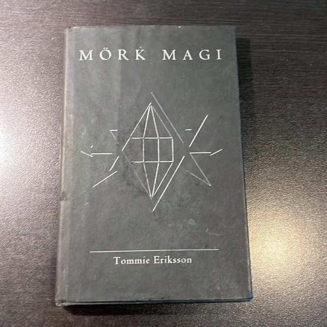
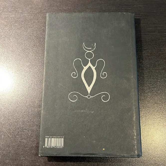
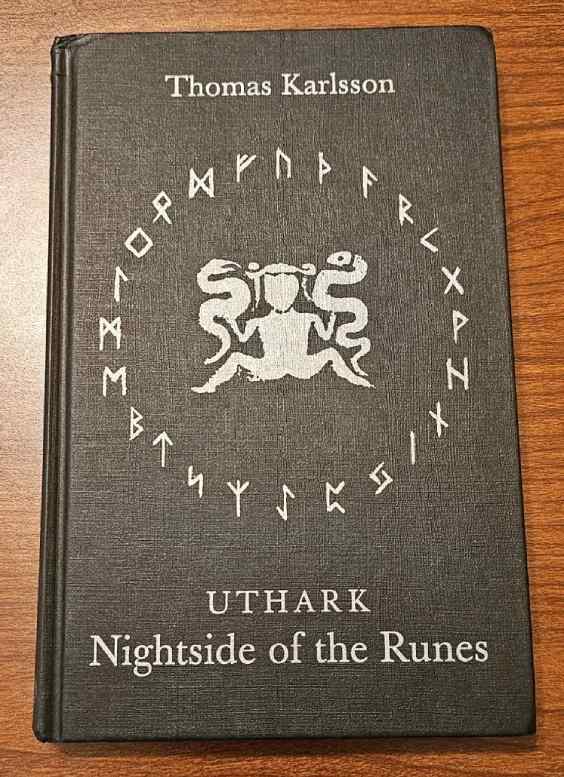
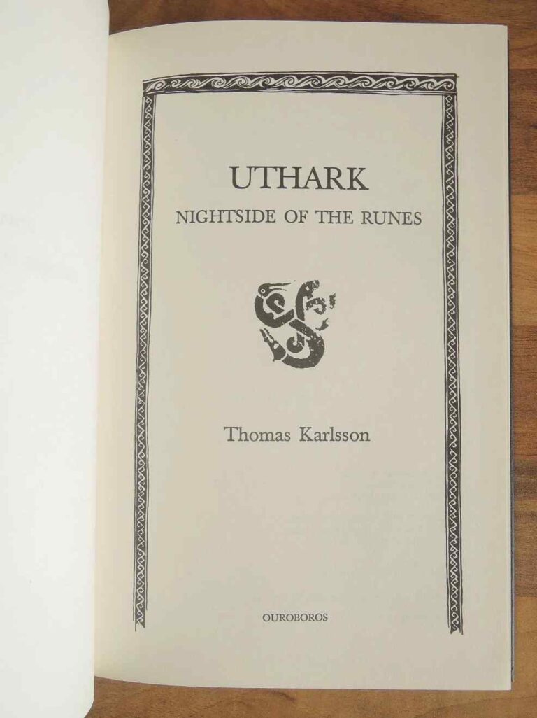
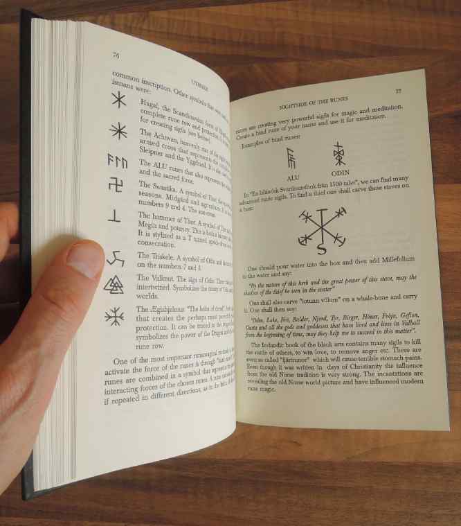
Timo’s first book-design assignments came from Ouroboros Produktion, a Dragon Rouge-affiliated publisher based in Stockholm. The collaboration began in 2001 with Tommie Eriksson’s Mörk magi, followed the next year by Thomas Karlsson’s Uthark: Nightside of the Runes.
TILMANN: I’m pretty sure I still haven’t seen actual copies of those books – Timo never sent me any sample spreads. The only Ouroboros title I own is the Swedish edition of Karlsson’s Qabalah book, which was very systematically designed and clearly worked through in great detail.
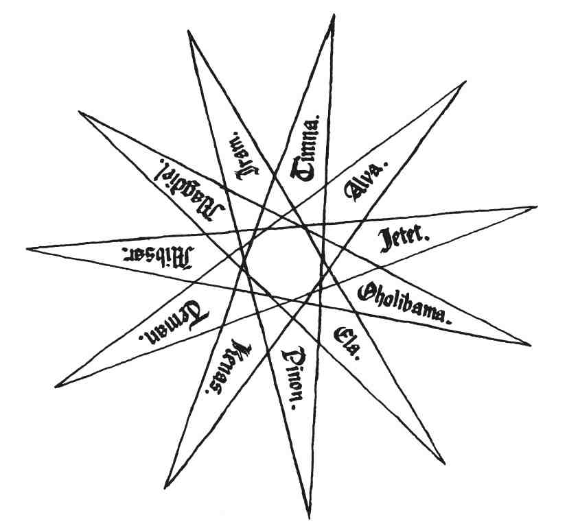
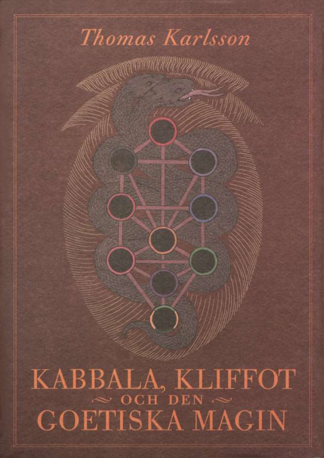
In 2004, Timo completed his third book assignment: Kabbala, kliffot och den goetiska magin by Dragon Rouge founder Thomas Karlsson, again published by Ouroboros Produktion.
TILMANN: Leafing through it now, I’m fairly sure he got the typeface from me. Which is forbidden, of course – you’re supposed to license fonts properly. But I can imagine myself pointing him towards it as a suitable body face for the subject and overall character of the book. That kind of intuition comes with experience.
Can you see anything you might have done differently?
TILMANN: The main issues are proportion and readability. For example, the column is a little wide; sixty-five to seventy characters per line is generally the recommended range. A taller, narrower block of text also looks more elegant and leaves greater space around it. Then there is the running header: it’s underlined, and the rule feels too heavy. I corrected both for the English edition.
TYLER DAVIS: I don’t know the man all that well, but this whole ‘Fonts must be licensed properly!’ thing feels very, very Tilmann. Timo was more of an anarchist in that regard. At one point, he pirated Photoshop for me, along with a few other ill-gotten programs. It’s a curious contrast between the formal and the informal, especially when you consider how those instincts manifested in practice – DROWNED versus Dauthus, for instance.
In recent times, Tyler and Tilmann collaborated on Liber Ketola, the posthumous monograph devoted to Timo. Their first shared undertaking had come almost two decades earlier, with Qabalah, Qliphoth and Goetic Magic – the English edition of Thomas Karlsson’s 2004 book.
The chain of connections began when Tyler and Timo became acquainted through The Ajna Offensive’s involvement with DEATHSPELL OMEGA’s “Kénôse”. Timo subsequently introduced him to senior Dragon Rouge member Tommie Eriksson, who was seeking a label for SHADOWSEEDS. Around the same time, KAAMOS’ second album, “Lucifer Rising”, led Tyler to contact guitarist Kosta Papavassilou – another initiate of the order.
TYLER: Back then, I still had a real interest in occult and magical working groups, lodges, things of that nature – and no way to connect with any of them in America. I travelled quite a lot when I was younger and lived in Oakland, outside San Francisco. Every time you heard the words O.T.O., you’d also hear ‘chlamydia’ or ‘gonorrhoea’, because they were basically sex cults and excuses for orgies. So, um, not exactly much incentive to join.
The Ordo Templi Orientis was founded in Germany at the turn of the 20th century and remade by Aleister Crowley during the 1920s as a vehicle for Thelema, with sexual magic at the heart of its higher degrees. The Bay Area has been one of the order’s strongholds since the American revival of the 1970s.
TYLER: And the few people I did meet who were involved struck me as highly unstable individuals. The Dragon Rouge members I corresponded with, though, seemed solidly grounded – doing incredible things without becoming dogmatic. Dogma has its place; I can get behind plenty of Crowley’s. But in general, it leads to stasis, which I think is counterintuitive to the magical worldview.
Did Dragon Rouge have any presence in the US?
TYLER: No – at the time, I was essentially practising alone within their system, and I didn’t know anyone else in America connected to the Draconian current. So, I wanted to get my hands dirty, as it were. I decided to go over there, visit Dragon Rouge in person, extract something from the experience, and bring it back home.
Did you actually know any Swedes by then?
TYLER: I’d kept in touch with many of them for quite a while, though my sense of dates is non-existent, so I couldn’t tell you exactly when it began. It must have been at least a year before I arranged the trip – enough time to build up the courage to actually fly over and meet all these people.
The visit also brought Tyler into contact with the Swedish metal underground. He attended a KING DIAMOND concert and DISSECTION’s “Reinkaos” release party, while meeting musicians already tied to The Ajna Offensive, including Emil Lundin of DÖDFÖDD and Johannes Kvarnbrink of MORTUUS. His main objective, however, was to bring another Swedish band to the label: WATAIN.
TYLER: I met Erik Danielsson to persuade WATAIN to work with me on their next album, “Sworn to the Dark”. I stayed one night at Axel’s (ONDSKAPT) place, then went to visit you. Timo was in Sansepolcro, and I believe Tena (Shadow Records) and Mika (OFERMOD) were both in prison. I also ended up visiting the Dragon Rouge lodge – the space already mentioned in the series.
At the time of Tyler’s visit, Dragon Rouge held its meetings in the basement of Blå tornet – the Blue Tower, an Art Nouveau building where Swedish author August Strindberg lived until his death in 1912.
TYLER: I want to say there were probably six to eight people present for workings and other activities. I only attended for a single evening, most of which I spent with Kosta and Tommie, so I don’t remember names – or necessarily even faces.
Was that when you pitched the idea of an English edition of Kabbala, kliffot och den goetiska magin?
TYLER: Most likely. Meeting them in person, doing some work together… I remember going to a museum with Tommie and Thomas – I still have the photos, which is probably why it stuck. Once the book agreement was in place, Timo and I began corresponding regularly about the design. From there, the whole thing just gathered enormous momentum.
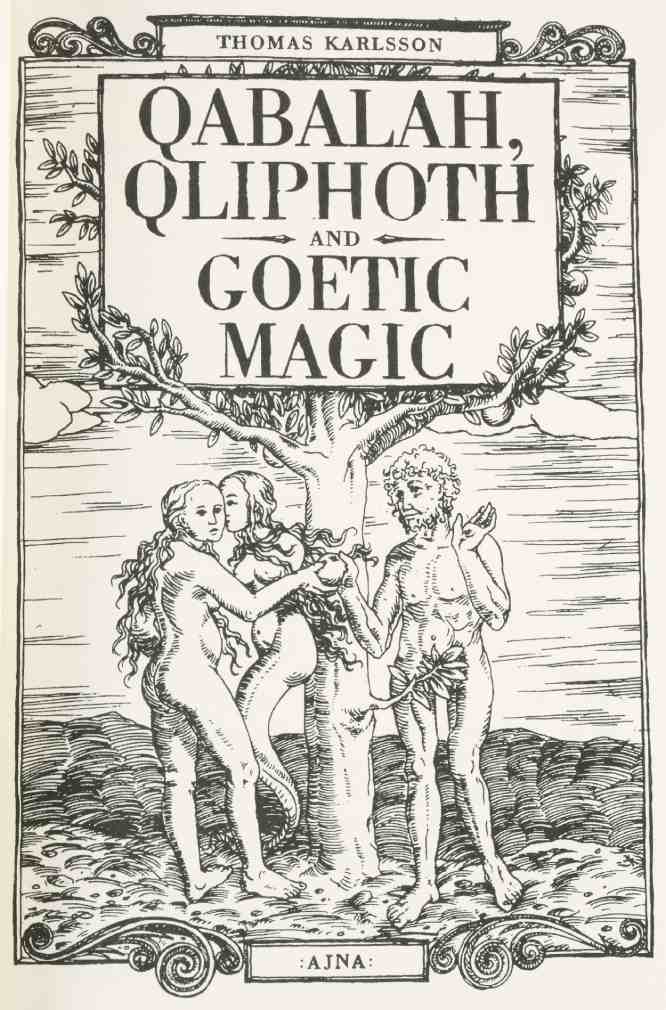
TOMMIE ERIKSSON: I first produced a base translation, and then Timo put me in touch with a friend of his who was doing a doctorate at some university in England. Since I’m not a native English speaker, he helped me edit the text. It’s quite time-consuming, as I’m sure you know – just three or four pages of corrections and notes would take at least an hour.
Tommie was asked to handle the translation on the strength of his past experience as an author, good command of English, and familiarity with the subject matter.
TOMMIE: Then Tyler came in, and we made another pass together. He and I worked on it daily, going through the text and developing the material in various ways, while Timo focused on the design. It was an extensive and highly demanding process – all three of us sitting in some kind of pressure cooker, working ourselves half to death.
TYLER: It’s funny how Tommie remembers it that way – then again, by the time I came in, he’d already been through the book once as the translator. For me, the text was new, and it became my first experience of a proper editorial review. It felt like moving into another phase.
You mean as a publisher?
TYLER: Yes. I had published a book before, but nothing on this level. From the outset, it was clear that the project could open an entirely new direction for The Ajna Offensive. So while Tommie might look back on the process as demanding, I found it incredibly exciting.
Did you try any of the techniques described in the book?
TYLER: Nothing specific comes to mind. The book contains very few guided meditations or rituals, and I don’t remember us trying any of them directly. We did perform some magical work together, but it related to other aspects of Dragon Rouge.
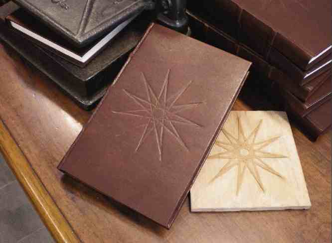

TILMANN: If I remember correctly, Timo wanted to concentrate on the illustrations added to the English edition, so he asked me to review the design. I fine-tuned the geometry and overall setup to accommodate the new proportions and whatever additional content had been included. I think we shared the typesetting, though I imagine I handled most of it, since that kind of work is not very practical to divide.
This was the first project where your relationship moved from mentorship into direct collaboration. Did working alongside Timo confirm the impression you already had of him as a designer?
TILMANN: Without question. As expected, he became completely absorbed in the project and worked with the utmost dedication. I can think of very few people who would bring so much care to a collaboration like this, or possess such a sharp eye for details others might not even notice.
TOMMIE: A classic Ketola collaboration, one could say – an otherworldly eye for detail and perfectionism, combined with a very particular workflow, at least in terms of Timo’s daily rhythm. It was hilarious to read about the TEITANBLOOD layout; everything sounds intensely familiar. Especially this tendency to document the whole process by email, so you end up following his internal monologue as the schedule unravels.
Nasko put it best in the “Seven Chalices” chapter: ‘It was like an email diary, chronicling his experiences.’ Timo held long, nocturnal conversations seemingly with himself, wrapping each delay in an essay-length account of what had gone wrong – from power cuts and ‘afternoon syndrome’ to the interference of ‘Lesser Gods’.
TOMMIE: Instead of, ‘Pardon the delay, you’ll hear from me at three’, it would be: ‘Right, I’ll work on that serpent in the Qliphoth tree on the front cover now, but then I have to head out for lunch and a walk through the graveyard. And after a glass of wine, I might take a nap – so let’s reconvene in about five hours.’ Getting these raw glimpses into his world was fascinating.
TYLER: I can confirm <laughs>. Emails, once again – endless, exaggeratedly long messages explaining in detail why he was delaying the work. And don’t forget that Timo always had a ‘Now Playing’ signature at the bottom of his emails.
log in to keep reading
The second half of this article is reserved for subscribers of the Bardo Methodology online archive. To keep reading, sign up or log in below.
Related reading